Best fonts in Squarespace: 2023 fonts list and font pairings
I don’t know about you but I love fonts. I could get lost for days on Creative Market looking at all the fonts for sale. The flip side of this is complete overwhelm and the fact that you lost days simply looking at letters. The good news is that you can skip all this stress because Squarespace has some amazing built-in fonts that you get to use for free on your website, plus I’m sharing the best fonts in Squarespace and my favourite font pairings below that I’ve curated through building dozens of Squarespace for clients.
Whether you’re looking for a high-end serif font or a modern and clean sans serif font, Squarespace already has all the fonts you need.
Feel free to use the table of contents to skip directly to the section you need.
Table of Contents:
Pre P.S. This post contains affiliate links. When you click on an affiliate link and make a purchase, I receive a small commission at no cost to you. Affiliate links are marked with an asterisk (*).
What Fonts Does Squarespace Use?
Squarespace* includes the use of Adobe Fonts and Google Fonts on your website without having to pay an extra fee or uploading custom fonts using complicated code.
While not every single font is available directly in the back end of Squarespace, a paid subscription includes over 1,000 Adobe Fonts and 600 Google Fonts.
I trust you’ll be able to find something that suits your website and brand with that many to choose from! You can also strategically choose fonts for your brand that you know are included in Squarespace so that your visual branding is consistent across all platforms.
If not you can still upload a custom font using the Custom CSS panel although it’s not the easiest process. However it’s still an option if your heart is set on a font that isn’t available in the Squarespace fonts library.
Complete Squarespace Font List
Surprise, surprise, there isn’t a complete list of Squarespace fonts! Why not?
I suspect it’s because old fonts get removed from the library and new fonts get added to the library so regularly that it would be a waste of time to try and list them all.
Your best bet is to just start a new Squarespace* trial (you can start as many new Squarespace websites as you want for 14 days without paying a dime) and then take a look at the font list by following the steps in the section called “How to Change Fonts in Squarespace”.
You can also keep reading to find my curated list of high-end Squarespace fonts and font pairings.
The Best Fonts in Squarespace
After building dozens of Squarespace websites for clients, you’ll find my curated list of 20+ fonts (from the entire collection of 1,600+ Squarespace fonts) organized into serif and sans serif.
All example images are using the Regular weight of the font.
I’ve also included what weights each font is available in on Squarespace, as some fonts are available all the way from thin and light to extra bold and black on Adobe or Google, but only regular or regular and bold weight on Squarespace.
It’s best not to fall in love with a certain weight of a font while browsing on Adobe or Google and then realize you can’t use it on Squarespace without custom code. This is why I start on Squarespace itself while choosing a font for a brand.
Also make sure you type some filler content on your test site to see the styling on specific letters like a, g, q, t, w, y, z. Those are common letters where you might be looking for a certain letter shape. For example, I have a note that on the Ratio Modern font the lowercase letter t is styled strangely with a curve and a sharp point. I love every other letter except that one.
This is an example of why you’d want to see the font on a test website before making your final choice. You can even insert a text block and manually type out the entire alphabet and common punctuation in both uppercase and lowercase letters to make sure you see all of them, especially the less common letters like Q and Z.
Serif Fonts
Adobe Caslon Pro

This font has what feels like some medieval styling since it’s based all the way back to typesettings in the 1700’s. Change the spacing to -0.02em or more to give it a modern feel, when it’s spaced out it can feel like you’re reading some sort of printed traditional manuscript.
Available in the following weights on Squarespace:
Regular (400)
Semibold (600)
Bold (700)
Note: If you like Adobe Caslon except you’d like the inner arms on the uppercase W to overlap, try Adobe Garamond Pro instead.
Antic Didone

This is an interesting serif font with graceful curves and thin lines. Although the font has been designed with readability in mind (something called the X-height for you font nerds), I find that due to its thin strokes it’s harder to read than other serif fonts. It’s also not available in anything but a regular weight. I recommend you only use this for your header font which is what it was originally designed for anyways.
Also look out for the unusual styling of the lowercase y.
Available in the following weights on Squarespace:
Regular (400)
Cabrito Didone Normal & Condensed

I like both the Cabrito Didone font family in the normal and condensed forms. There’s lots of personality in this font with its heavy serif stylings that almost look like drops. I also love the graceful curves on the upper part of the letters b, d, h, and t.
This font is very flexible as you can use every single weight from thin all the way to bold (100 to 700 in website speak). It’s rare for fonts to include a book weight (300) and demi weight (600)!
In short, this is an approachable, fun and feminine font that’s sure to add lots of personality to your brand and website.
Available in the following weights on Squarespace:
Thin (100)
Extra Light (200)
Light (300)
Regular (400)
Medium (500)
Semibold (600)
Bold (700)
Coranto 2 & Coranto 2 Headline

Coranto has a really nice combination of angles and curves and in the bold weight feels almost like a heavy 1970’s serif font.
The Coranto 2 Headline is more condensed than the regular Coranto 2 version, so if you want some more space between letters make sure to choose Coranto 2.
Coranto 2 is available in the following weights on Squarespace:
Regular (400)
Bold (700)
While Coranto 2 Headline is available in more weights on Squarespace:
Light (300)
Regular (400)
Semibold (600)
Bold (700)
FF More Pro (called FF More on Adobe)

FF More has angular tabs as the serif decorations lending it a unique look that carries into the italic style as well.
I find it’s an interesting mix between a traditional feeling serif font with a more modern viewpoint that’s sure to stand out when everyone else is using other popular fonts.
Available in the following weights on Squarespace:
Light (300)
Regular (400)
Medium (500)
Bold (700)
Black (900)
IVYPRESTO Display

This font was a huge breakout hit since it was introduced in 2020. You started seeing it everywhere, and for good reason! It’s been hard to find a sans serif font that’s both timeless and modern that looks amazing both in uppercase and lowercase letters, as well as in normal styling and italicized.
IvyPresto Display really does it all.
There is also IvyPresto Headline available on Squarespace which is a little heavier in it’s weights, and IvyPresto Text that has more kerning (space) between the letters and is easier to read at smaller font sizes when used as a paragraph font.
I especially like IvyPresto Display in a light weight, and while it’s available in the thin weight on Squarespace, I find that it’s too hard to read (and readability is always a top priority in web design!).
Available in the following weights on Squarespace:
Thin (100)
Light (300)
Regular (400)
Semibold (600)
Bold (700)
Lora

Lora is a classic sans serif with some personality (but not too much!) due to it’s serif strokes and subtle, graceful curves. It’s italic style is especially feminine with larger swoops.
If you don’t like how feminine the italic style of Lora is, try Coranto 2 which has a more angular italic style.
I especially love Lora’s ampersand style! You’ll find that ampersand styles (i.e. &) vary greatly between fonts and I like a classically shaped ampersand which Lora has.
In fact, I love this font so much that at the time of writing this article (September 2023), Lora is my paragraph font and what you’re reading right now.
Available in the following weights on Squarespace:
Regular (400)
Bold (700)
Lust Text

Here’s a font I bet you’ve never really heard of or used and damn, does it have style! I love this font the more that I look at it.
Lust Text is a very balanced, proportional sans serif font with classic styling but still feels modern. It doesn’t feel too tall or wide, and it brings in some personality with it’s unique looking lowercase A and K.
Available in the following weights on Squarespace:
Light (300)
Regular (400)
Medium (500)
Bold (700)
Black (900)
Mencken Std Head

Another lesser used font if you want your website to look more unique, Mencken Std Head was designed as a transitional font, meaning that if you want a classic look that’s also modern, this font is a great choice. Interestingly it was first developed for the newspaper The Baltimore Sun before being offered commercially for all of us to use.
It’s got clean, sharp strokes balance with the playfulness of a drop shaped serif (known as a ball terminal) on the lowercase letters a, c, f and r.
There’s 2 choices on Squarespace: Mencken Std and Mencken Std Head.
I like the headline version (Mencken Std Head) because I like a lighter weight font but that’s just my personal preference.
If you want to see Mencken in action, check out Katherine Hart’s website for which I chose Mencken as her headline font.
Both Mencken Std and Mencken Std Head are available in the following weights on Squarespace:
Regular (400)
Bold (700)
Extrabold (800)
Operetta

Operetta is a family of fonts with different optical sizes that tell you what version to use depending on the font size.
For example, if you’re going to use Operetta for small paragraph text, you’d want to use Operetta 8 or 12, the number meaning the smallest font size it’s easily readable at.
If you’re going to use Operetta for large headers, you can go for Operetta 18 or 32. There is an Operetta 52, but since you can only assign one font style to all Headers in Squarespace, it’s likely that your smallest header style (usually Header 4) will be smaller than 52, so that’s why I’m recommending a smaller optical size.
Operetta is a Didone style font, meaning that there’s a combination of thick and thin strokes that looks elegant and European (which is where the font style originated).
If this font looks familiar it’s because a similar Didone font is used for the Vogue logo which likely influences why this font feels high end and editorial.
All Operetta variations (from 8 to 52) are available in the following weights on Squarespace:
Extra Light (200)
Light (300)
Regular (400)
Medium (500)
Semibold (600)
Bold (700)
Extrabold (800)
Black (900)
Playfair Display

Playfair Display is a super popular font (i.e. don’t use it if you want to look unique) that’s like the North American version of Operetta above. It’s transitional in design, meaning it looks classic and traditional but still modern.
It’s so flexible that in the heaviest weight (Black) and italic style it almost looks like a retro, 1970’s style typeface.
This was my main Header font in the previous version of my brand from pre-2020 and I still love me some Playfair Display (especially the ampersand!).
Available in the following weights on Squarespace:
Regular (400)
Bold (700)
Black (900)
Tenez
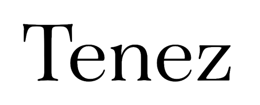
I’ve been wanting to use Tenez in a project for a few months now, it has so much personality!
It’s based on the more European styling of a Didot or Bodini font (which you also see in Operetta) but with a more organic feel, especially with the uppercase letters. Just look at that R!

I mean, come on! Use this in bold, friendly brands that still want to look high end but don’t want to feel stuffy. It’s like a super rich person who you think is going to be a snob but they turn out to be the nicest, funniest person you know.
The one thing you want to keep in mind is that it’s best used as a header font, so stay away from using it for very small print or longer paragraphs.
Available in the following weights on Squarespace:
Light (300)
Regular (400)
Bold (700)
Black (900)
SANS Serif Fonts
BRANDON GROTESQUE

Brandon Grotesque has been a favourite of mine for years. It was my paragraph font for my first Ashley Srokosz brand back in 2014, I didn’t use it from 2018 to 2020, but I came back to it in 2022 with the launch of this website.
This font is based on magazine fonts from the 1920’s and 1930’s, and I really like the slightly rounded corners that show up especially pronounced on a heavier weight. This slight rounding of the corners makes it feel more friendly, approachable, and less serious than Neue Haas Grotesk.
I especially like using it in all uppercase letters as I’ve used it on my website you’re looking at now.
Note that the period and punctuation with this font is rounded (unlike some sans serif fonts where they’re square).
Available in the following weights on Squarespace:
Thin (100)
Light (300)
Regular (400)
Medium (500)
Bold (700)
Black (900)
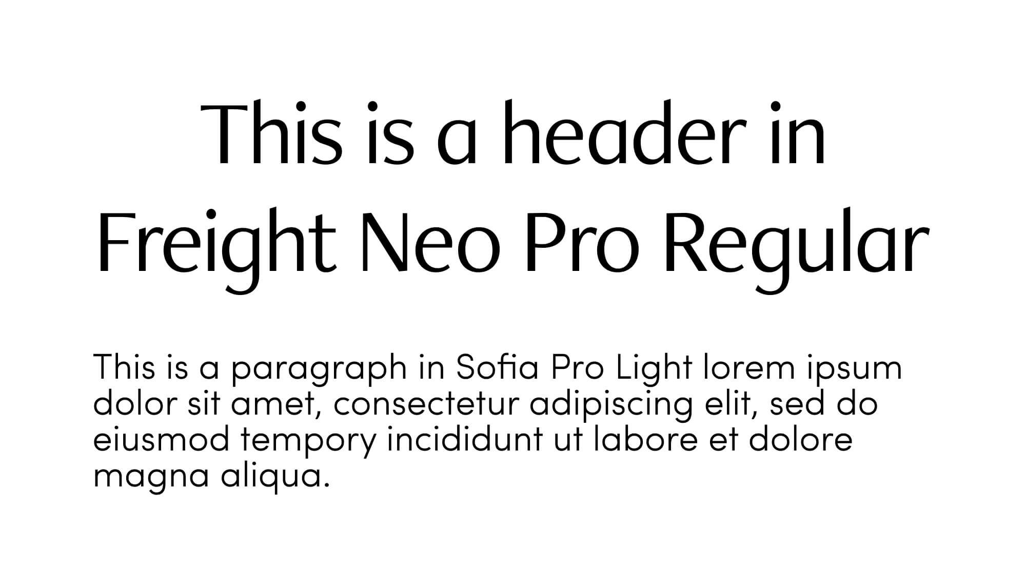
Freight Neo Pro

Freight Neo Pro is a humanist style font which means that it’s style mimics the angles that a right-handed person would hold a calligraphy pen with a nib while writing Latin letters. You can see this in the slight angle at the top and bottom of the strokes (such as the top of the stroke on the lowercase letter i).
This font is super clean while still having some personality (thanks to those angles) and would be perfect for a brand who doesn’t want a serif font but doesn’t want just straight lines like they would find on a perfect geometric font like Neue Haas Grotesk.
Note that it’s still very easy to read using a Light weight while other sans serif fonts can be almost unreadable at that weight.
I also love that the period and punctuation with this font is rounded.
Available in the following weights on Squarespace:
Light (300)
Regular (400)
Medium (500)
Semibold (600)
Bold (700)
Black (900)
Lato

Lato is an all-around powerhouse sans serif font that’s super popular as a result.
Whether it’s light or black weight, normal or italicized, lowercase or uppercase, or large or small, Lato is supremely readable and attractive.
The period and punctuation with this font is rounded.
There are a few peculiar features, such as the ampersand (I don’t love it but that’s just me!) and the fact that in a normal style the lowercase a is double-story but when it’s italicized it’s single story.
Otherwise dare I say that this flexible font is a good choice for pairing with tons of other fonts!
Available in the following weights on Squarespace:
Thin (100)
Light (300)
Regular (400)
Bold (700)
Black (900)
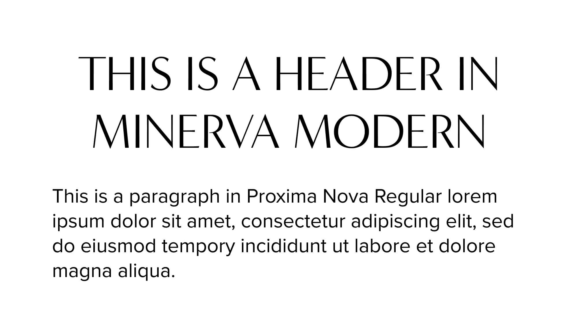
Minerva Modern

This is a super clean font that, again, I’d love to use in a client project. Look how high end, clean and elegant it looks! I could see this on a skin care brand or maybe even a clothing company? It’s so good!
I like how the lowercase double-story a still feels like a sans serif font without the fuss, and the wider uppercase M gives it some balanced width.
If you’re looking to communicate that your brand has confidence, this is a great font to try out.
Note that while the period and colons are round, the comma and apostrophes are very angular. I know, I know, it’s the smallest detail but not my favourite (although it does feel consistent with the font style).
Also note that it’s not available in as many weights as some of the other sans serif fonts on this list.
Available in the following weights on Squarespace:
Regular (400)
Bold (700)
Black (900)
Neue Haas Grotesk Display

I love this font so much that I used it as the paragraph font on my new brand agency website.
You might not know this font by this name because it was changed to Helvetica. Yes, this is a good old dependable Helvetica by it’s original name!
Can you believe this font was originally designed in the late 1950’s? Those Swiss designers really knew what they were doing.
It was designed to be readable at small and large sizes, from it’s thinnest to heaviest weight, and it’s one of the rare fonts that is available in Squarespace at almost every weight.
The only thing I’d change about this dream font is that the period and punctuation is square. Oh, how I’d love a round version!
Available in the following weights on Squarespace:
Thin (100)
Extralight (200)
Light (300)
Regular (400)
Medium (500)
Semibold (600)
Bold (700)
Black (900)
Poppins

Poppins is a super popular font that’s been used slightly less than Lato. If you’re looking for the same feel as Lato but with a single-story lowercase letter A, then try out Poppins. It feels slightly more casual because of this.
Note that the comma is more of a slash style without the roundness of the period.
Available in the following weights on Squarespace:
Light (300)
Regular (400)
Medium (500)
Semibold (600)
Bold (700)
Proxima Nova

Looking for Lato but with a single-story lowercase letter A? Proxima Nova is for you!
Proxima Nova is wider than Neue Haas Grotesk if you like that font but it isn’t quite perfect.
Fun fact: apparently Proxima Nova is the most popular commercial font used on websites in the entire world!
The period and punctuation with this font is rounded.
Available in the following weights on Squarespace:
Thin (100)
Light (300)
Regular (400)
Medium (500)
Semibold (600)
Bold (700)
Extrabold (800)
Black (900)
Quiche Sans

Quiche Sans feels almost like an Art Deco style font to me with it’s clean lines, high x-height and stylized letter Q.
For a modern, minimal font it has tons of personality which you don’t always get from a geometric sans serif like Proxima Nova or Neue Haas Grotesk.
The period and punctuation are rounded.
There’s not much I don’t like about this font and I especially love that it comes in many weights which makes it super flexible, although I’d still keep to using it mainly as a header font.
Available in the following weights on Squarespace:
Thin (100)
Light (300)
Regular (400)
Medium (500)
Bold (700)
Extrabold (800)
Black (900)
Raleway

You can always see Raleway coming a mile away from that telltale overlapping w (which I personally hate). Otherwise I love almost everything about it!
Did you know you can remove the overlapping W using custom code in Squarespace, as well as change up the style of a few other letters (like the double-story A)?

Pssst: Want to know how to do this? Send me an email and I’ll send you the code!
If you do these style changes it feels very similar to Poppins except it’s a thinner weight, so keep this in your back pocket if Poppins isn’t quite perfect for you.
The period and punctuation are square.
Raleway is the only font on this list with every single weight available in Squarespace, making it an extremely flexible and useful font.
Available in the following weights on Squarespace:
Thin (100)
Extralight (200)
Light (300)
Regular (400)
Medium (500)
Semibold (600)
Bold (700)
Extrabold (800)
Black (900)
Sofia Pro

Sofia Pro is similar to Poppins except it has a higher x-height (only you font nerds will care about this). For everyone else, just know that this higher x-height makes Sofia Pro very easy to read even at the smallest text sizes.
It also has more open letter styles than Poppins and the punctuation is vertically orientated instead of the slight slant in Poppins.
Otherwise Sofia Pro is another friendly, approachable, easy to read sans serif that you can use on everything from headers to paragraphs to buttons.
The period and punctuation are rounded and the commas are slightly curved (versus the straight slash used in Poppins).
Available in the following weights on Squarespace:
Thin (100)
Extralight (200)
Light (300)
Regular (400)
Medium (500)
Semibold (600)
Bold (700)
Black (900)
Squarespace Font Pairings
Squarespace* allows you to pick a separate Header and Paragraph font which almost triples your work with picking a font because now you don’t only have to think about what separate header and paragraph font to pick, but also how those fonts will look together (known as a font pairing).
Picking an amazing font pairing can take time but here are a few general guidelines that will help make it easier:
Try picking one font for both the header and paragraph but using different weights or styles. For instance, try a bold weight for the header and regular for the paragraph font. Or you can italicize or use all uppercase letters for the headers and keep the paragraph font normal.
Try picking one serif and one sans serif font. I personally love how a serif font looks as the header font and the sans serif as the paragraph font but on this website I’ve done the opposite!
Alternatively, if the brand you’re working with is very clean and minimal, choose two sans serif fonts.
If you use a serif and sans serif font as your font pairing, choose two fonts with the same style of letters. For example, they’ll look more cohesive if both fonts use double or single story letter A’s.
Here are some examples of some Squarespace font pairings using only fonts from my favourites list above:
IvyPresto Display & Raleway

Let’s start with the popular IvyPresto Display and Raleways. This is an example of a serif font (IvyPresto Display) paired with a sans serif font (Raleway).
I’ve used the Light weight of IvyPresto Display and paired it with Raleway Regular. I used custom code to change the style on the letters L and W on Raleway so that it matched the style of the same letters on IvyPresto Display to give it a more cohesive look.
Lust Text & Lato
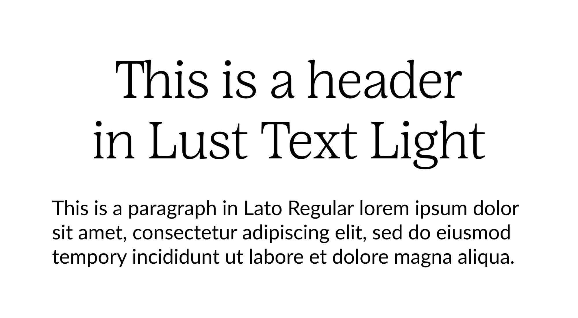
Here’s Lust Text in a Light weight paired with Lato in Regular weight, another serif header font with a sans serif paragraph font.
Lato almost looks like a serif font which is why I like it with Lust Text in a Light weight. The letter A’s in both fonts are double-story, which helps it to feel cohesive since the styling on the lowercase A in Lust Text is so distinctive. Also the style of the letter G’s are similar as well (with both being closed).
Tenez & Poppins

The last serif header font paired with a sans serif paragraph font is Tenez and Poppins. Like I said above, I looooove the Tenez font and am waiting with bated breath to use it on a client project.
I love it in an uppercase style in Regular weight because I want to see more of the styling on the letter R with it’s little curve at the end. I paired Poppins in a Light weight with it because I wanted a simple paragraph font that wouldn’t overpower Tenez.
Quiche Sans & Lora

I wanted to show you an example of a sans serif header font paired with a serif paragraph font using Quiche Sans in Regular weight and Operetta 8 in Regular weight.
If you didn’t read the spiel about Operetta above and the difference between Operetta 8 and 52, I’m using 8 here because a paragraph font is fairly small text and while I don’t anticipate we’ll go lower than a 12 pt font, I wanted to be sure it would be a readable as possible at the smallest size.
I love how these two fonts feels together. The styling on the uppercase Q in Quiche Sans feels similar to the upwards flick on the lowercase G in Operetta.
Minerva Modern & Proxima Nova
Here’s our first font pairing with two sans serif fonts. I chose to use Minerva Modern in a Regular weight and uppercase, it’s so clean and modern, and I paired it with Proxima Nova in Regular weight to add in a classic styling with the double story A’s.
If I used Minerva Modern in lowercase styling I might pair it with something else, but in this instance it feels balanced.
Freight Neo Pro & Sofia Pro
Here’s a second pairing of two sans serif fonts with Freight Neo Pro in Regular weight with Sofia Pro in a Light weight.
Since Freight Neo Pro has lovely angles and straight lines I paired it with Sofia Pro that has straight lines but with personality where the letters F and I meet. It feels like a similar styling and I like how the header font is slightly bolder in weight than the paragraph font.
How to Change Fonts in Squarespace
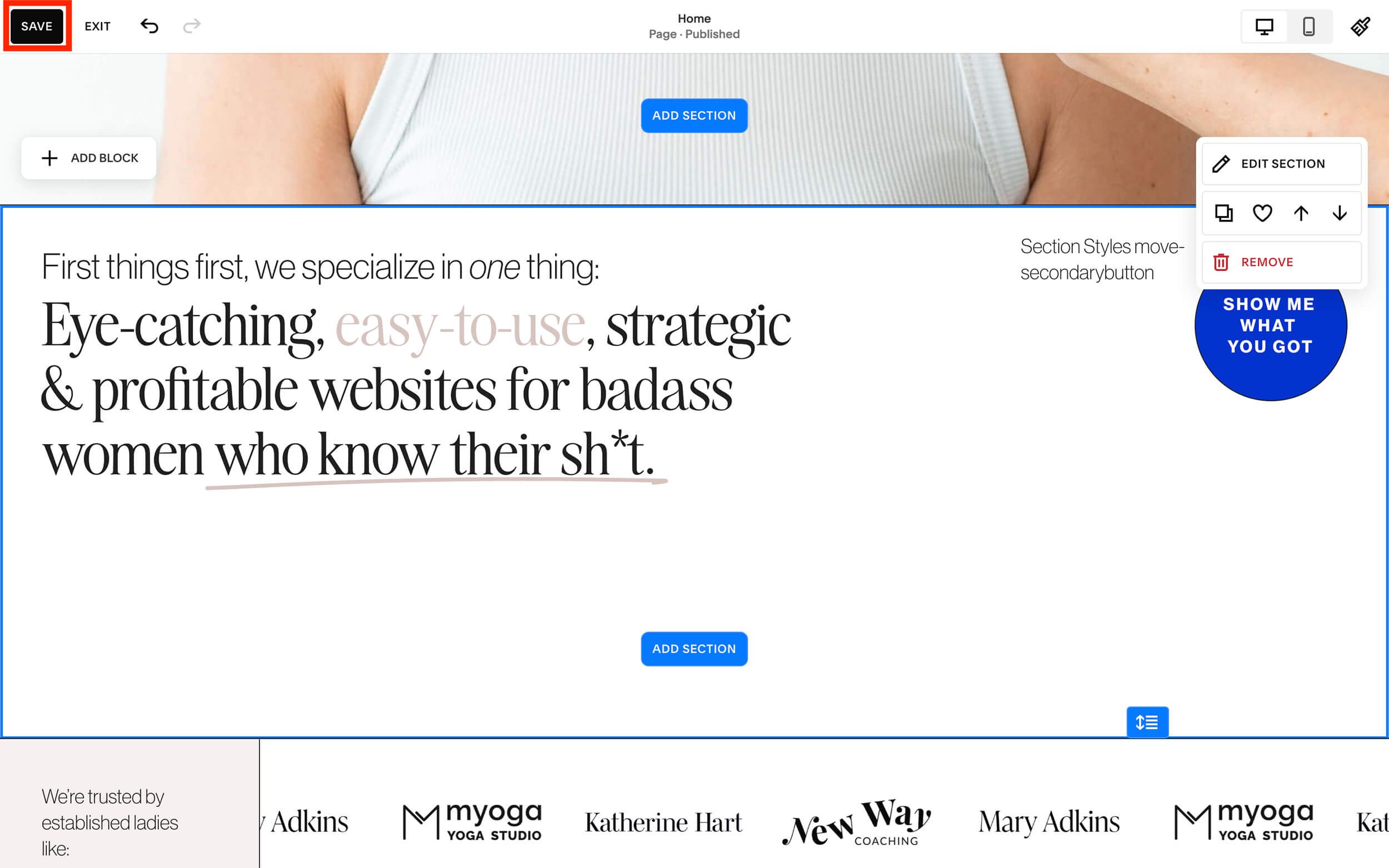
1. Log into the backend of your Squarespace website and access the site styles panel by clicking on the paintbrush icon in the upper right hand corner of the preview window.

2. Click on “fonts” to access the fonts menu.

3. To change the header font, click on “Headings”. You can make changes to the paragraph, button, and miscellaneous fonts by clicking on those instead and following the same steps as below.

4. Click on “Family”, the top setting from the list, to change the font family.
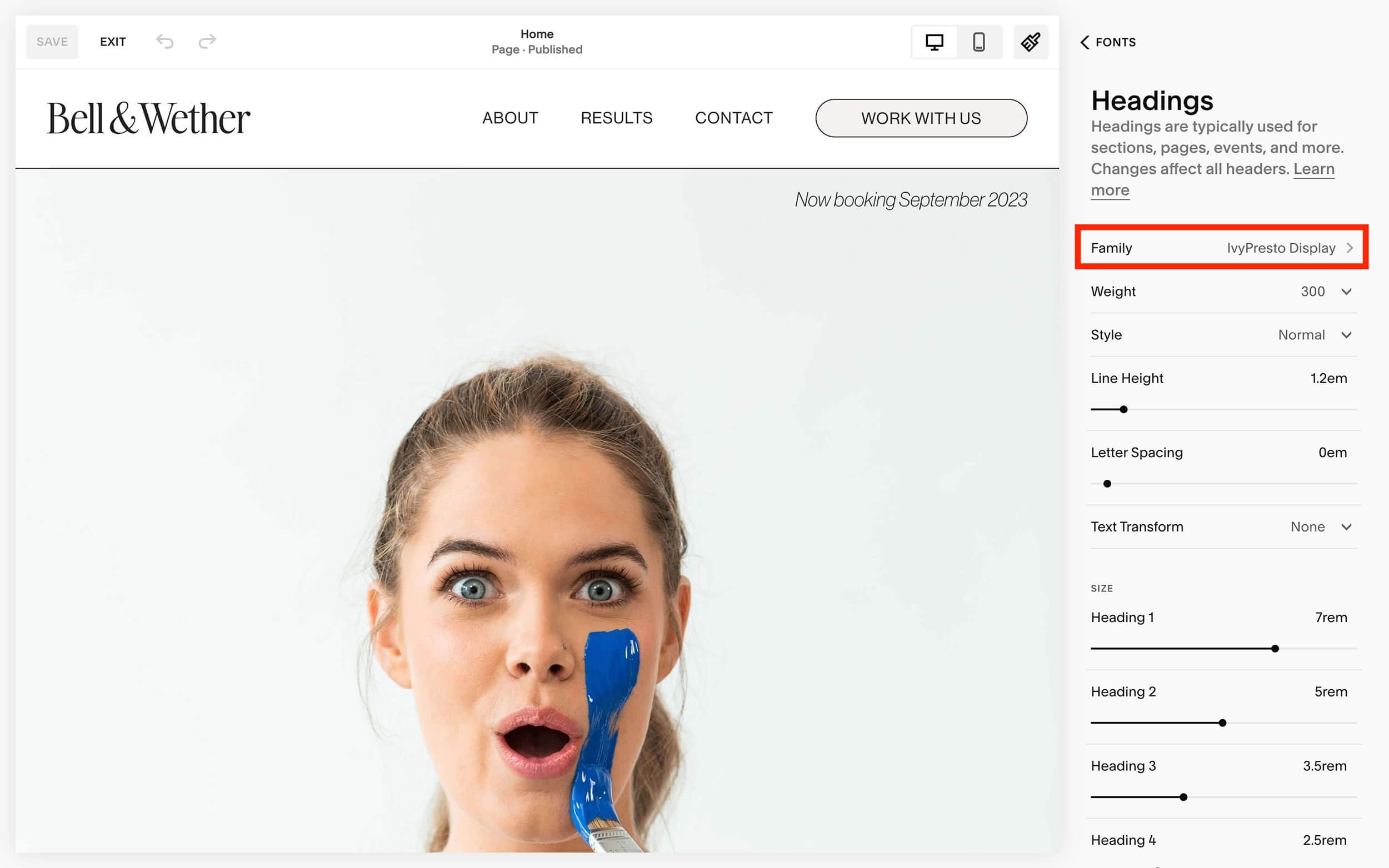
5. Click on “Browse all fonts” if you don’t see the name of the font you want to use from the list of fonts already loaded in your style guide.

6. Type the name of the font you know you want to use into the “Search fonts” search box or scroll through the list below that search box to browse for a font you want to use.
You’ll find the following categories:
Sans serif fonts - the most popular sans serif fonts
Serif fonts - the most popular sans serif fonts
Display fonts - the most popular fonts used for larger text such as headings
Script fonts - the most popular script fonts (i.e fancy or handwritten style fonts)
Slab fonts - the most popular fonts that are very thick and blocky
Mono fonts - the most popular fonts with fixed widths (think typewriter-like fonts)
Other fonts - the complete alphabetical list of all fonts available on Squarespace that haven’t already been listed in the categories above
To see what a font will look like on your site, just click on it for an instant preview.

7. Once you’re happy with the font you’ve chosen, click on “Headings” at the top of the font panel to access the other font style settings.
Alternatively if you’re editing your paragraph or button font it might say “Paragraphs”, “Buttons”, or “Miscellaneous” if you’re editing those styles.

8. Change the other font style settings such as:
font weight (light to black)
font style (normal or italics)
line height
letter spacing (space between letters aka. kerning)
text transform (none aka. normal, all uppercase, all lowercase, capitalized aka. the first letter of all words will be capitalized)
font sizes
Note that these font styles are sitewide meaning any changes you make on this font panel will affect every page on your website.

9. Repeat steps 3 to 8 from above for your paragraph, button, and miscellaneous fonts.
10. Once you’re done changing your font settings for all 4 types of fonts, click on “Fonts” at the top of that panel to get back to the Fonts menu. Scroll all the way to the bottom and click on “Assign Styles”.
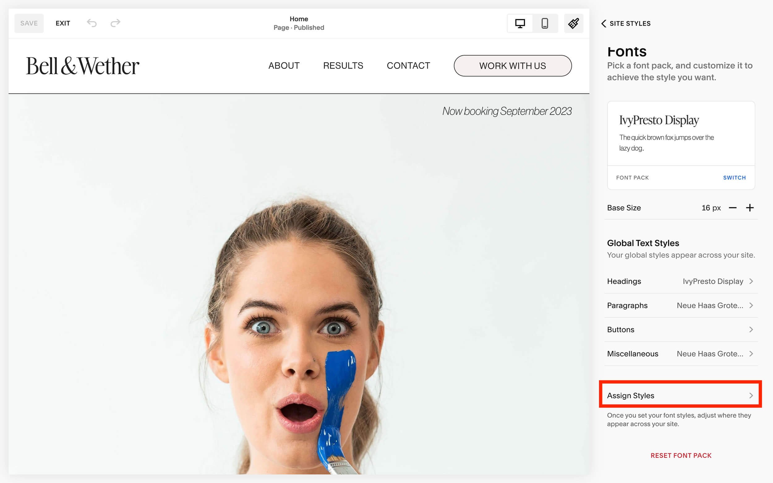
11. This is where you’ll assign font styles to all the other random fonts on the site such as the site title, form blocks (i.e. contact forms), product descriptions and prices, and more.
Click on each individual type of font that you’re interested in changing and choose a new font or change the font styles.
NOTE: every new font you use across the site will increase loading time. Try and limit the total font families used on your website to 3. You can use those 3 font families in different styles to provide variety (i.e. uppercase, different weights, etc). Trust me, the search engine gods will thank you if you stick to a maximum of 3 font families.

12. When you’re done making all the font changes you want, click on “Save” in the top left-hand corner of the preview window.
You can then click the back button at the top of the right hand styles panel to get back to the master fonts or site style menus.
To get back to the main menu of Squarespace, click on the paintbrush icon in the top right hand side of the preview window (the same paintbrush icon we clicked on the access the Site Styles menu) and then click “Exit” from the upper left-hand corner of the preview window (to the right of the “Save” button).

I love how Squarespace makes instantaneous changes to your fonts in the preview window so you can browse different fonts and font styles. Just another reason to love Squarespace!
How to Change Font Colour on Squarespace
1. Navigate to the page you want to change the text colour on and click “Edit” in the upper left-hand corner of the preview window.

2. Find the text block where you want to change the colour of the text and highlight the specific words you want to change with your cursor.

3. Click on the text colour command in the text editing bar.

4. You can choose one of the colours from your site colour palette that you’ve preset in your site styles:

Or you can choose a brand new colour by clicking on “Custom” and then moving the focal point around the colour spectrum or by inputting a specific colour code below the spectrum.

5. Once you’re done making any other changes on the page, be sure to save your changes by clicking “Save” from the upper left-hand corner of the preview window.
There you have it, everything you need to know about the best fonts on Squarespace*. Clearly we’ve barely scratched the surface with over 1,600+ built-in fonts to choose from but this should get you started.
Choosing fonts should be made at the beginning of your website process, and be sure to use the same fonts (if possible) in any other marketing on other platforms. Consistency is key!


