
How to pick the best wellness website template for your business

One of the most time saving things I recommend when it comes to building a wellness website is to buy a template, especially if you’re DIY’ing it or you’re brand new to building websites. However, with the sheer number of website templates on the market, it can be overwhelming. Not to mention that while some wellness website templates might look nice, they might be a total pain in the butt to customize for your particular needs. Don’t give up and hire a professional designer for thousands of dollars just yet, let me teach you how to pick the best wellness website template for your business!
Here’s how it usually goes when you’re ready to build your own wellness website:
You decide you want to DIY it, since you might not have $5,000 for a website designer OR want to wait 6 months for your dream designer to have an opening in their calendar.
You learn about website templates, and they seem like the perfect solution to save you hours of time and countless headaches while you try to figure out how to use a website building platform.
You start looking for a website template, and there are so many beautiful ones to choose from! Cue: overwhelm moment #1.
After hours of searching, you finally find the perfect website template. The colours are lovely, the images are gorgeous, and you can’t wait to see how your website ends up. You’re so excited that you’re literally vibrating!
You buy the website template and start installing it. It’s not too hard, you’re just following the step-by-step instructions. So far, so good.
Now what? You’re staring at the template that looks exactly like it did when you bought it … and you have no idea WHAT to put on it. What do you write? How do you fill all this space? You only have 3 professional images of yourself and about 15 image spots to fill on the template? GAH, do you need to book another photoshoot?! It’s got room for what looks like four different lead magnets or opt-ins and you only have one. Cue: overwhelm moment #2.
You spend the next few months sitting in this overwhelm, and are even more panicked because frankly, you expected to be done your website by now. Why does it have to be so hard?!
Spoiler alert: it doesn’t have to be so hard, it’s just that you might have bought the wrong website template for your particular business.
It’s not your fault! You’re not a professional website designer and didn’t know what to look for.
The problem is that website templates are usually non-refundable, so if you buy the wrong one, you’re either stuck with it OR you have to write off the cost (all in the name of having a “learning experience” 🙄) and buy another one.
After purchasing about 8 different website templates for my own business, not to mention designing 5 myself and having almost 250 students through my course about building a kick-ass wellness website, I’ve designed a foolproof process for you to pick the best wellness website template for your business:
#1 Buy a wellness website template that comes with a copy template
This is something you would never know unless you’ve worked with a professional website designer before, but the copy (i.e. all the writing on every page of your website) actually needs to be written before you start designing a website.
It’s actually copy first, design second, which is the exact opposite of what you’d think when you’re not a professional website designer.
The reason is that certain design aspects, like sections, sizes of fonts, even images, are dictated by what the copy is trying to communicate.
For example, one really amazing line of copy could be in a much larger font than the rest of that section, be the headline attached to an attention grabbing image, be in a box that has a different coloured section than the rest, or singled out with lines on the top and bottom.
Not to mention that there are ways of aligning copy so that it doesn’t look so long, such as arranging paragraphs in side by side columns. Long paragraphs of copy means people get overwhelmed and might click away from your website. You want to break up copy as much as possible while still delivering exactly what you want to say.
Here’s an example:

The design of this section is dictated BY the copy, so if you’re buying a website template that’s been designed for you without taking into account your copy, you could spend tons of time after the fact rearranging entire sections (and sometimes messing up the original template!).
Do yourself a favour and purchase a website template that includes a copy template.
It won’t tell you exactly what to write, you actually don’t want the written copy on your website to be the same as anyone else’s (for search engine optimization purposes), but clear directions as to what each section should include and what the focus should be along with recommending the approximate length of copy for that particular section (i.e. should you write 3 paragraphs or 3 sentences to fit the design?), plus a few examples, will save you loads of time and many headaches later.
Here’s an example of a detailed copy template, and how much direction it can give you, from the website template included in my Brand, Build, Blog course:

#2 Buy a wellness website template that includes features you actually need
Generally people buy a website template based on how it looks versus the features it includes.
Yes, a ‘pretty’ looking website is important, but pretty doesn’t always equal profitable.
Looking for features that will help you convert random website visitors to email subscribers is what will help you create a relationship with more people, which helps foster trust. And it’s only after people trust you that they’ll invest in your programs or services.
Here are features that will help you build trust quicker, as well as helping to build your email list faster:
sections on the home page and any sales pages where you can share testimonials
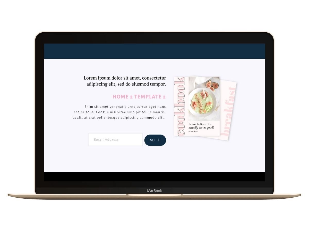
a section close to the top of the home page drawing attention to an opt-in (aka lead magnet)
a pre-footer (i.e. a section above the very bottom footer) where you can draw attention to an opt-in
an announcement bar across the top of your website to draw attention to your most popular opt-in
a polite pop-up that shows itself after a certain period of time or interaction on your website (e.g. someone spends 30 seconds on your website or scrolls 50% of the way down a page), again drawing attention to your most popular opt-in
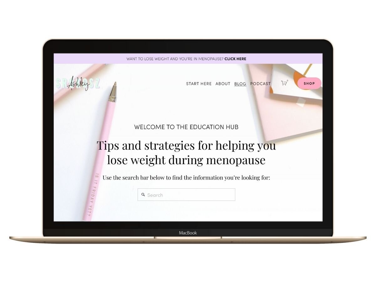
the ability on a blog for website visitors to find the exact information they’re looking for quickly, utilizing features like a search bar or category drop down
Here are some examples of what these sections or features might look like on a website template (taken from my Brand, Build, Blog course website template):
Beware of website templates that are marketed towards photographers. They will tend to be very image gallery heavy, and don’t have a lot of focus on driving opt-ins.
#3 Ignore the pretty colours & pictures
I’m totally guilty of this, but I’m drawn to certain website templates based solely on how they look. Of course we are, that’s how you sell website templates! However, if you’re going to change all the colours to your brand colours, and all the pretty pictures are going to get switched out, your website might not look like the template that you fell in love with.
This is why you need to focus on the features and not just the appearance, because most likely the appearance will change.
Below is an example of a website template that, on the surface, looked pretty good. It was eye catching and seemed like it would include all the features you would need … but when you take out all those pretty images that you most likely won’t be using on your own website? The home page doesn’t have many calls to action that invite people to visit other pages and know what to do next.
A website template with amazing images:

The same website template with images removed:

I’m not saying there’s anything inherently wrong with the template above, it’s a gorgeous website template! However, with the lack of strong calls-to-action, you’re relying on gorgeous images to convert website visitors to read more of your content.
If you don’t want to use those exact filler images OR if you don’t have enough of your own photos, this might not be the website template for you.
Also, there is a section close to the top drawing attention to your contact page (the “get in touch” button), which is a complete waste of the top of one of the most popular pages on your website. I’d convert this to a lead magnet opt-in section, which I can do easily enough as a professional website designer, but might be harder for you if you’re not as experienced.
Plus, what’s the point of paying hundreds of dollars to save time if you have to spend more time customizing it!
Same thing with the bottom subscribe section. There aren’t many people who want to plain old “subscribe for your updates” anymore. Everyone asks for an email now, and people are sick of it (can you blame them?!). You have to add real value to get them to part with their precious email address , so again, if this was the website template you purchased, I’d beef up that last subscribe section with a specific lead magnet.
#4 Make sure all the images are fully customizable with easy-to-use software
Most website templates you can purchase for Squarespace now come with customizable images, but since I don’t use other platforms, I’m not 100% sure this is a given with every website template you might consider (for example, on Wordpress).
Since you didn’t design each section of each page, you might not be aware of how changing an image from a portrait-sized image (longer than wider) to landscape (wider than longer) will affect the design of the overall page.
You might think you can just switch out a simple image for one of your own, and before you know it, a different sized image is making the paragraph beside it do strange things (like wrapping itself around the bottom) or it’s throwing off the other paragraphs below it.
I’ve found the best solution to this as a website design newbie is to purchase a website template that includes images with frames, meaning the size of the image is set, and you can switch out your own images to customize it without altering the image size and the overall page design.
You can do this easily in Canva, which many people have experience in. Just delete the image you don’t want and insert your own. Voila! The process takes less than 30 seconds.
A website template that comes with completely customizable background banners, which is where you have an image behind the written copy or other images, is also helpful so that you can keep the feeling of the template that you spent your hard earned money on but make it match your own branding.
Here’s an image that shows you the difference between your regular images and your background banner images (both should be easily customizable, like mine are in the Brand, Build, Blog master website template):

In conclusion, here’s a handy dandy checklist of what to look for when you’re going to purchase a wellness website template for your health business (copy and paste!):
☐ includes a copy template
☐ testimonial feature (on home page and/or sales pages)
☐ a section close to the top of the home page drawing attention to an opt-in
☐ a pre-footer where you can draw attention to an opt-in
☐ announcement bar feature
☐ polite pop-up feature
☐ a blog
☐ search bar or category drop down features on blog
☐ ability to add a shop later on (if needed)
☐ all images are customizable in software you know how to use (including regular and banner images)
The best template for your wellness website

Let me save you hours of time by narrowing down my choices for the best wellness website templates available on the internet today.
Here’s my curated list of 3 wellness website templates that check as many of the above boxes as possible.
I’ve purchased (or created) website templates from all of the companies that I recommend, so I know that the process is as easy as possible for even the most inexperienced website designers.
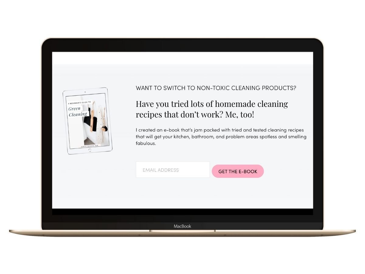
Just fill in your info below to get my list of the “3 wellness website templates that rock!”
Now there’s literally no excuses left for you to create an amazing wellness website of your own.
Website templates for an easy-to-use website building platform, like Squarespace, can make building your wellness website fun, and cut the design time in half. What are you waiting for? Your website isn’t going to build itself!


