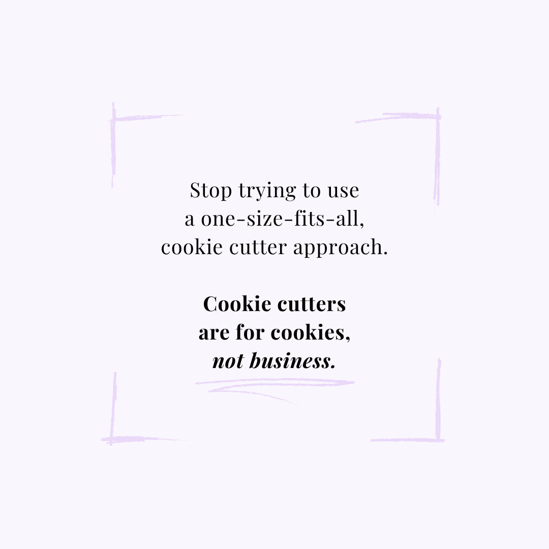
You don't need a logo, you need a brand

The very first thing that I ever did for my business, back in 2008, was to choose the name and logo. This seemed very logical, since I was in the process of registering my business with the Canadian government, and the first required information on the form was "Business name".
I named the first iteration of my business "Pure Vitality". As I remember, the reasoning behind this was that I wanted the name to indicate how I was going to help people feel alive, full of energy and life, and overall healthier. I started writing down all the words that resonated with me, and then plugged them into an online thesaurus until I came up with something that sounded good to me.
I then took that name, registered for the domain, and designed a logo by typing "Pure Vitality" into Microsoft Word, playing around with fonts until it looked pretty. Here's what it looked like:

To me, having a logo made me feel professional. It meant that I was taking my business seriously, and that clients could take me seriously.
I used my logo like Frank's Red Hot sauce: I put that shit on everything.
It was on the top of all my intake forms, my business cards (obviously), the sign that I made with my business hours to go on the door to the office that I rented, and labels that I put on the outside of the folders that I gave my clients for all the handouts I provided them.
At the time, I had an EAV machine and was selling supplements that were recommending during the testing. Some clients would purchase 4-5 bottles of supplements, so I bought some brown paper bags at the dollar store for them to carry all the bottles home in. Well, that was just another opportunity for me to plaster my logo on something else! I got a stamp made with my logo so that every bag would have my business name on it.
I did everything short of putting my logo on pens and fridge magnets ... only because I couldn't afford it!
I thought that as clients walked down the street with my logo-embossed bags, someone else would see it, stop my client, and ask "what is 'Pure Vitality'?". My client would rave about me, and referrals would be flowing through my office door like nobody's business.
Let me ask you this: how many times have you seen someone carrying a specific logo-stamped bag down the street, and thought to yourself that you needed to run to that store and purchase something this. very. minute?
I'm guessing never.
What I didn't understand at the time was that a logo has nothing to do with business results. It's all about your brand.
The reason why stores put their logos on shopping bags is that they already have brand recognition, and when you see someone carrying their bag down the street, it's not that you are going to go and Google that store name because you've never heard of them. It's merely a reminder that you need to go to the store again, plus social proof that other people shop at that store, therefore they like it, and you've made a good decision by shopping there, too.
So what do I mean by branding? Well, there are tons of definitions of branding, some more hard to understand than others.
To me, branding is the overall feeling that someone gets when they see, read, or hear anything that has to do with your business, so they know that they're in the right place.
For example, if you see the famous swoosh logo or the phrase "Just do it", you automatically think of Nike. Sure, you think about sports, but it's more than that. Deep down, it's about empowerment, and feeling like you can start (and finish) just about anything. This is why Nike's main branding is in red and black, as those are very bold and action-oriented colours.
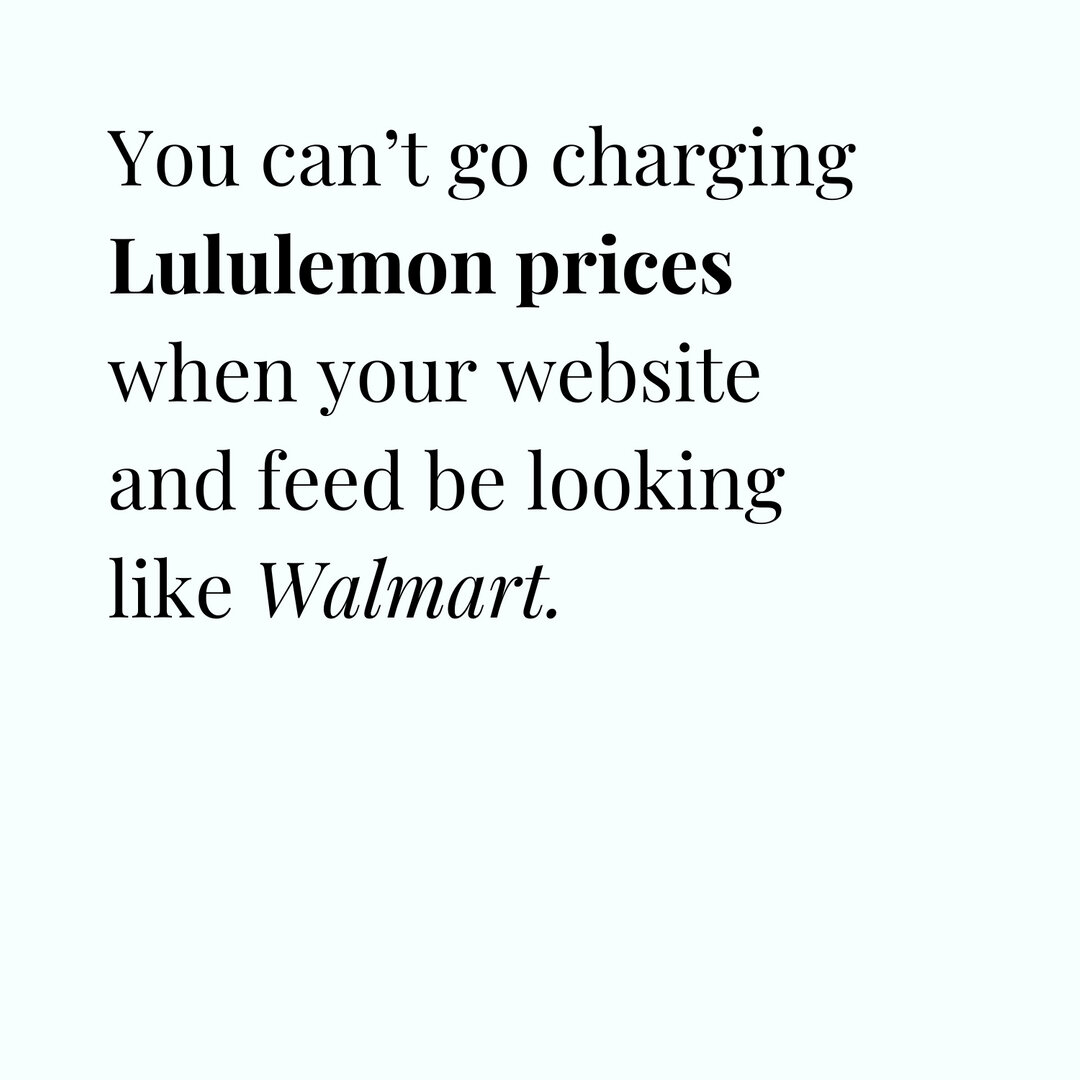
Now, even though they sell some similar things, think about Lululemon. Their logo is also red and black, and they're all about you feeling empowered, too. However, do you feel the same when you think about buying something from Lululemon as you do from Nike? Nope, not a chance.
Lululemon is all about hard-core yoga and training clothes. Even though you could wear their gear to play basketball, would that be the first company you would think of when it came time to purchase? Probably not.
It's because the brand is more than the logo, it's about the overall feeling. Nike tends to attract people who want to buy clothes for basketball, golf, or hockey, while Lululemon attracts others who want to buy clothes for yoga, pilates, or even just lounging around.
Same brand colours, same end feelings, totally different types of people being attracted to the business.
This is the same for your business. You might be teaching, talking or writing about the same topic as someone else, but because of the way that you do it, you might attract totally different people.
For example, your passion and focus in your business might be adrenal health, but you could attract the following different types of people, all dealing with adrenal issues:
moms with young children, who are burned out from taking care of everyone else first
high-powered, single workaholics with no kids, who are burned out because they work 80 hours a week
men who extensively train and run marathons or triathlons, who are burned out simply because they're been physically pushing their bodies harder than they're capable of
Same topic, different clients. The way that you talk to, coach, and make lifestyle recommendations for each of these 3 clients would be totally different. Moms won't trust you if you post on social media that you were out drinking at a club with your friends until 2 am, and men won't relate at all to you if all you write in your blog posts how adrenal hormones are related to your PMS or menopause symptoms.
Branding is what gives potential clients a feeling of your business, working with you, and what it'll be like if they follow your recommendations (whether those recommendations include certain clothes to wear - like Lululemon, using essential oils, eating certain foods, working out, etc), but what actually makes them experience those feelings?
Here are 5 things that make up your branding:
1. Colours
Every colour subconsciously makes us feel something different. Green reminds us of nature and growth, and is often used in the holistic health industry because of this. Blue is calming and spiritual. Red is passionate (think red lipstick) and authoritative (like when your teacher used to mark your tests with x's and checkmarks).
This doesn't mean that if you're in a specific industry that you can't use certain colours. If you're in the holistic health industry, for example, you could use red just like Lululemon does, but it needs to be balanced with other brand elements.
Here are 2 examples of mood boards from my own business, with my brand words of how I want my ideal client to feel on the bottom. The resulting colour spectrum that I used is on the right side of each picture. Notice that they have a few overlapping feelings (fun and bold), but the one on the left (which is the basis of the branding of this site that you're on right now) feels a little more energetic with the bright orange.
The one of the right is for a new course that I'm launching (you can think of it like a sub-brand of my main website), and I want it to feel limitless. The pictures of the sunset and beach feel that way to me, and the colours are a little more muted and washed out than the more saturated colours of the left mood board.


2. Fonts and typography
I could look at fonts all day, I love them that much. It's amazing how two different fonts can give you such a different feeling about a business. This is an entire college design course in and of itself, so I'm not going to go too much into detail, but with a few examples you can start to understand why fonts are an important part of your brand.


What does the above font on the left remind you of? To me, it feels like the front of a 80's rock album, a little AC/DC. The colours really remind me of Saved by the Bell! And the one on the right? The script font feels very feminine, like a wedding invitation. Also notice that there are similar colours on each picture (light blue, pink, pops of yellow), but because the pic on the left is more geometric and graphic, it feels way more masculine than the flowers on the right in almost exactly the same colours.
If the left-hand picture was your branding, I'd say that you're trying to attract rocker chicks, while on the right you're going for very feminine, girly women. Same colours, but because of the fonts, two totally different feelings and ideal clients responding to those brands.


Now, let's look at these two above. The one on the left is a serif font, meaning that it has a small, decorative line added to the ends of the letters (almost like tails). The one on the right is a sans serif font, and has no decorative lines at the ends of letters.
Serif fonts tend to feel more classic, and sans serif fonts feel modern. The "Wolfshadow" font above feels very English castle to me, like I might see it on a family crest somewhere. The "Signia Pro" on the right feels somewhat 1960's, mid-century modern to me.
Here's how I broke down the fonts for this website:

My display typeface (aka headline font) is Adelle Sans Bold, which feels very playful and fun to me. The secondary typeface is Brandon Grotesque, which is a sans serif font that feels very bold and fresh, and has multiple uses on my site.
It's capitalized and a medium weight for my subheaders (like captions or section titles), and is lower case and regular weight for my body/paragraphs (like blog posts). I'm really drawn to script fonts for accents, plus it's very trendy right now, so added in the Betterfly font for my accents. You won't really see these on my actual website, but I use these for quotes in social media pictures, as well as on hidden info pages.
3. Photography
You know the saying that a picture is worth a thousand words? It's a saying because it's true. Professional photography used to be just on your website, but now can cross over to social media platforms like Instagram. Photos, for example, can be light and bright or dark and moody, and everything in between, and should match your style of branding.
Here are two different pictures of popsicles that evokes two totally different feelings:

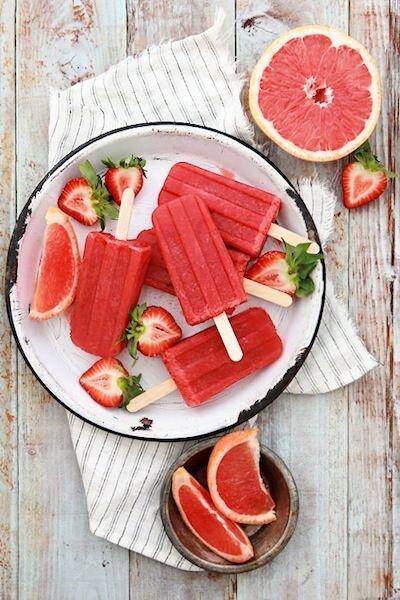
The one on the left feels like it was taken in mid-winter or during a cloudy day, while the right feels like if you eat those popsicles, a summery picnic will magically materialize around you. Neither style is right or wrong, it's what YOU want it to feel like. Most importantly, it needs to match the feeling of the rest of your branding elements in this list.
You can take it a step further, and style your pictures. For example, when I was preparing to pay $3,000 for a photoshoot when I re-branded my business in 2014, I left nothing to chance. I picked out clothes and purchased food ingredients to match and complement my new brand colours. I pinned pictures of how I wanted my hair and makeup to look. I made a list of every single picture that I needed to capture that day. Here's one picture from that photoshoot that, to this day, I look at and know that it's my brand through and through:

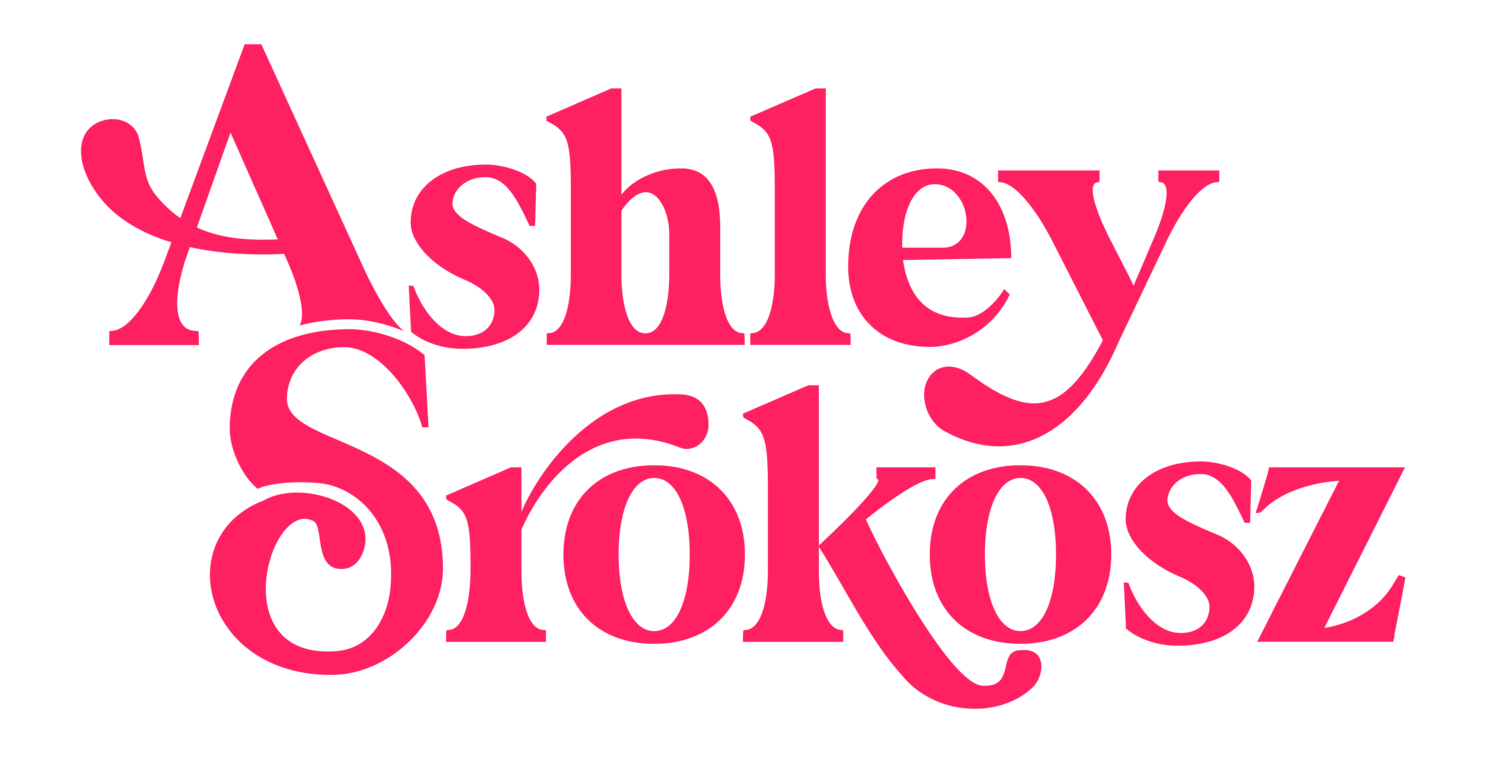
I was trying to be all serious and fancy (the picture was supposed to be of me deep breathing), but that's not really my brand. It ended up looking fun and colourful and a tad bit goofy, just like what you've come to expect of me. This is why this picture is the header on my About Page, because it's quintessentially Ashley Srokosz, which is the name of my business.
When you're trying to pick a photographer for new pictures (or you're dabbling in the world of food or lifestyle photography), pick someone whose portfolio most matches the feeling that you want in your pictures (light vs. dark, fun vs. serious), and the other details, like colours, can come into play with your props and accessories.
4. Writing style and examples
You'll notice that at the bottom of my mood board for this website, shown above in section 1, that I have 5 brand words for my business: fresh, fun, bold, irreverent, and approachable. Fresh, fun, and bold are very well represented in my visual branding on my website, with my colours, fonts, and photography. So how do I represent irreverent and approachable? Mainly with my writing style and examples that I use.
I swear and make dirty jokes, which seems very irreverent. I like to share examples from real life that other people can relate to, which makes me feel approachable to others. Even though you might think I'm perfect from looking at my pretty pictures, it's my writing where I share that things are anything but.
If you're very scientific and stiff in your writing, you'll give off a whole different feeling than someone who makes a lot of jokes. For example, the following two sentences give basically the same information:
"People with eczema can experience severe skin irritation, redness, and itching."
vs.
"Her eczema was so irritating that it was worse than fingernails on a chalkboard, and it made her want to scratch her skin off."
Same description of symptoms, two totally different feelings that the reader will get.
The types of examples that you make are going to attract different types of people, so you better make sure that what you're talking about is something that your ideal client actually wants to hear.
If your programs and services are a God-send for menopausal women in their late 40's and early 50's, and that's who you want to work with, don't include examples in your writing that references TV shows, movies, or books that only people in their 20's would tend to watch or read. Don't write about how you're annoyed that even though you're 25, you still have acne. Your ideal menopausal client won't relate to that, she'll subconsciously think you don't understand anything about her life (and related symptoms and problems), she won't trust you, and she definitely won't buy from you.
If you love to work with married women with young kids, even if you are single and childless (right now!), don't talk about a day in your life where you have no responsibilities except for yourself, took a leisurely bath at 10 am, and have pretty much all the time in the world. For sure don't talk about how your dog is the same as having a kid. I assure you, it's not. Trust me, moms will hate you if you say that.
I remember when I first heard about Sarah Jenks and her amazing program "Live More, Weigh Less". Even though it's meant to teach women how to lose weight effortlessly, which I didn't need at all, it was her branding and lifestyle that drew me in. However, I was a new mom with a 9 month old at home. I was still trying to figure out my new life with no alone time, and how to maintain my sanity while trying to keep another human being alive 24/7.
When Sarah was launching her program, she released 4 videos, one of which was kind of like "a day in the life of" for how she started her days. The camera followed her around as she woke up, did some yoga and stretching, and then meditated. When she was done that, she made a green smoothie, which she drank while leisurely reading a decorating magazine. Then she would get ready for the day, dressing in stylish clothes, doing her hair, and applying her perfect make-up that was customized just for her by her make-up artist friend. Then she said something that I'll never forget: "my whole routine takes me about 3 hours, and then I'm ready to start my day and get down to work. Because of my relaxing morning routine, I'm super productive and creative, and churn out amazing results!".
I heard this and wanted to cry. I desperately wanted what she was selling, but I actually said out loud "are you fucking kidding me? Wait until she has kids!". She got pregnant like 6 months later, and now has 2 kids under the age of two. She's the first to admit that most days she's losing her shit. However, at that time, I knew that her program was not for me ... and that was OK.
I wasn't her ideal client, and she made it super clear that I wasn't. That's the power of examples. Make sure that your writing and the examples you include are exactly what your ideal client can relate to.
5. Social media
Since ideal clients are more than likely coming across your brand not by your website but on social media, your feeds on each platform need to feel like your brand, too. Plus, if you don't have a full-on website yet, you can experiment with your branding on social media for free before investing in a website AND get instant feedback from your ideal client.
The main ways that you are probably sharing on social media includes:
interesting quotes
articles that your ideal client would find funny or useful
pictures of you in your everyday life
your blog posts or latest articles
Each of these things can be branded. For example, the following quotes themselves fit my brand feeling words of irreverent, bold and fun, plus the colours convey the feelings of fresh and fun (note: for readability, I darkened up the grey colour from my mood board). Both include only my branded fonts.


The articles that I share tend to be from other people who are as free with swear words or funny, honest truths like I am, because my ideal client has come to expect that from me.
For pictures of your everyday life, they should be taken in a similar style to your website (i.e. light and bright vs. dark and moody), and you can use props and accessories around your house to keep the colours consistent.
What makes the biggest difference in photo appearance and consistency is styling and editing. I had no idea this could majorly effect how people were perceiving my business on social media, but here's an example of how the visual branding can affect the overall feelings of your ideal clients about your business:


The above left is about 2 years ago, and the right is my current Instagram feed. I share the same pictures on Facebook. I know, without a doubt, that when new ideal clients come across my feeds, they feel that I (and my business) am fresh, fun, bold, and irreverent, while the captions are approachable.
Plus, it's a great way to use more pictures from that über expensive photo shoot from 2014 that didn't make it to my website!
By being intentional with your branding, you start training people to be able to recognize your work, whether it's a picture of food, a paragraph of writing, or certain colours. They'll think of you, and when they're thinking of you, they're more likely to buy from you.


